2

demo-practice-001

I was asked to do an art demonstration for the Southside Art League in Greenwood, Indiana.  I decided to paint with only the primary colors — red, yellow and blue.  I also explained that the picture should be broken down into shapes. Here’s how it turned out.


3

Scripps Pier 006

This painting is of the Scripps Pier in La Jolla, California. It has several art techniques — First, there are complimentary colors — the orange sand against the blue shadow which gives the painting a zing. There is a big contrast  between the shadow and light. Next is linear perspective. There is a vanishing point in the window at the end of the pier. All of the lines come from that. The pillars go further to the right the closer they get. There is atmospheric perspective. The closer pillars are larger on the page. The people in the foreground are larger than the ones out in the waves. The atmospheric and linear perspective give depth to the painting. There is vertical and horizontal rhythm — vertical in the pillars and horizontal to the waves.

3

Cars-on-Main-3-001

I love doing paintings of cars and of buildings. This one portrays late afternoon. There are a lot of reflections on the vehicles and in the store windows. I’ve used atmospheric perspective — the car on the left is bigger, giving the illusion of depth. The one behind it seems further back. When I did this piece, I broke the painting down into the shapes of each color or value, then painted them in. It was like putting together a jigsaw puzzle.

4

Beach-Painting-Finished

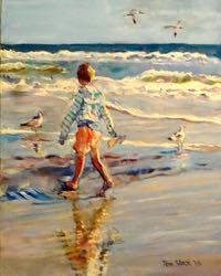
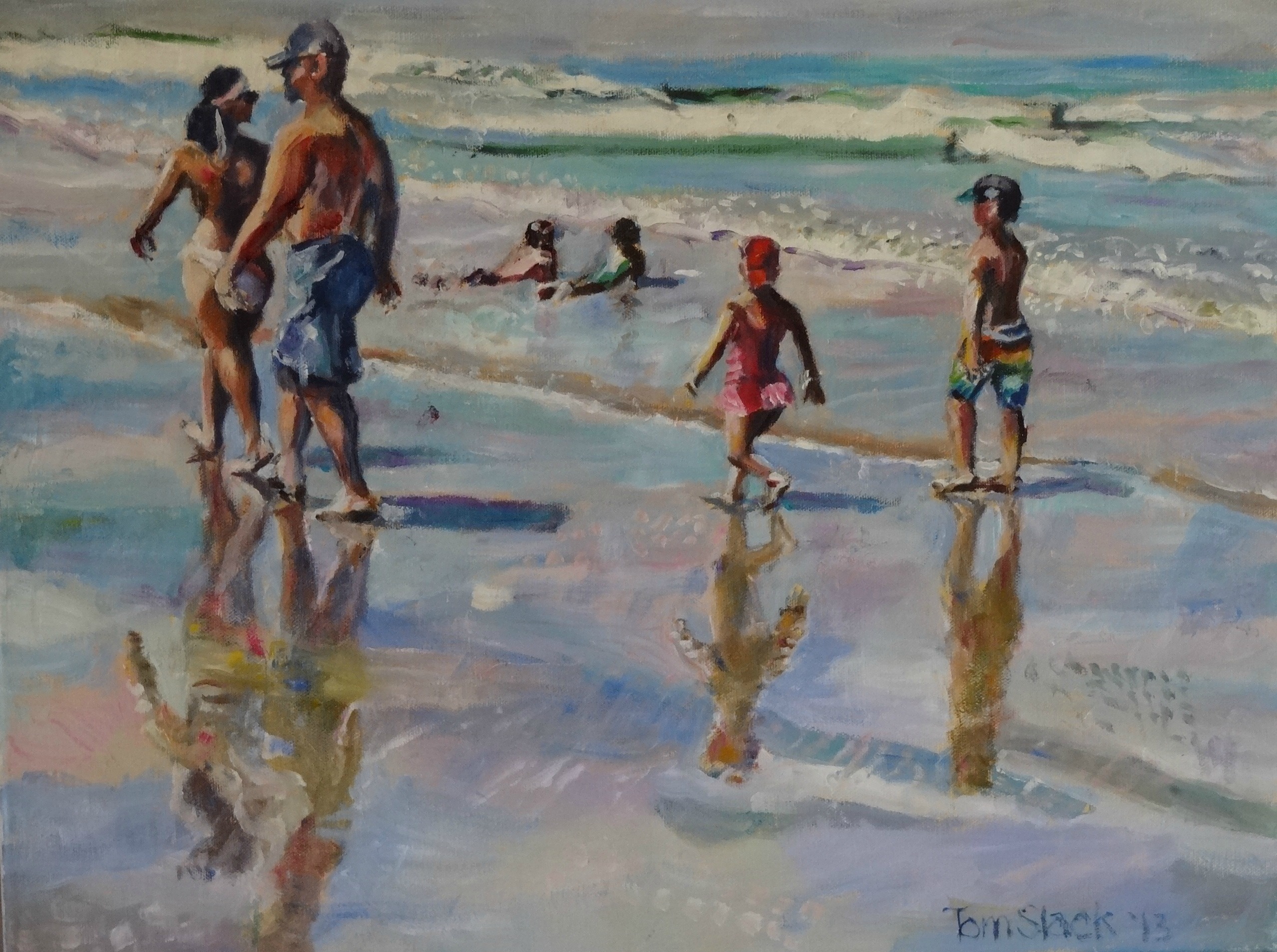
I grew up loving Annette Funicello and the Beach Party movies. They all seemed so magic. I also loved listening to The Beach Boys and their songs about surfing and being with their girlfriends on the ocean. It all sounded so magical to a young kid living in Utah. I didn’t think I’d ever make it to the ocean. Since then I’ve been to the Pacific and Atlantic many times, have been in the Bahamas and on the North Sea coast in Belgium. Those times were really fun, but I never felt that magic  . . .

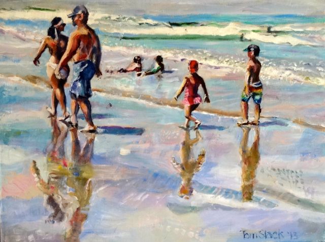
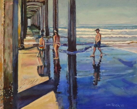
Until Labor Day weekend. I was visiting my daughters in San Diego. We went to La Jolla, but there wasn’t a parking space anywhere and the beach was really crowded. We finally  parked on a hill and walked down to the ocean. There was a pier there. I found out later it was the very famous Scripps Pier where well known  photographers do their work. As we walked along the sand I saw people having fun surfing, soaking up the sun and just walking along. I don’t know what happened, but I FINALLY FELT IT!!!  The magic came. This painting is my impression of the feel that day. I hope you feel the sun, hear the waves and the seagulls, feel the wet sand under your feet, and most of all, I want you to have butterflies in your stomach like I did.

4

Soldiers-and-Sailors

This is a painting of the Soldier’s and Sailor’s Monument in downtown  Indianapolis, Indiana. It is a commission for a man in the Navy in San Diego. He wanted it because he’s a sailor and his father was a soldier in the Army.

Basically I used geometric shapes like rectangles, cubes and triangles to come up with the picture. It was painted with linear perspective to give the feeling of height and depth. I’ve created the feeling of sunlight and shadow by the use of colors. The shadows have a bluish tint. The lighted areas have warmer colors like yellow and brown.

2

Portrait-in-Primary-Colors-011

All colors are made from red, yellow or blue. These are the primary colors. Today I had my wife sit for a quick portrait. I squeezed those three colors on my palette. If I mixed yellow and blue, it came out green. Yellow and red came up with an orange shade. Red and blue ended up violet.

3

White Bird 006

Norene and I do extensive travel to state parks throughout the midwest. We love the forests, the lakes, streams and waterfalls, but what we like the most is when we come across wildlife. We’ve driven past flocks of wild turkeys, through herds of deer, past squirrels, chipmunks and raccoons. This painting portrays a beautiful white bird. We didn’t see it at first, but soon we saw it’s brilliant white body against the black background.

This painting was done with a palette knife, no brushwork. It has horizontal bands of color contrasted by the bird as it stands vertically through them. The branches are organic compared to the geometric background. All of these, as well as the contrast between the bird against the dark forest behind it give interest to the painting.